Embark

Embark

Services

UX Design

UI Design

Design System

Information Architecture

Industry

Finance Tech

Year

2024

Overview

Embark is an advanced affordability assessment tool used by top organizations like NatWest, Santander, PayPal, and Virgin Money. It asks customers to fill out a detailed income and expenditure form, giving clients a clear picture of their financial situation. This comprehensive process helps provide personalized support, making it easier for people to manage their finances and address any financial issues. By understanding their financial health better, individuals can receive more effective assistance tailored to their needs.

Brief

The directive was clear: “Increase completion rates and decrease completion time.” Although Embark wasn’t performing badly, its platform was a bit outdated and needed improvements. By upgrading the user experience (UX) and user interface (UI), we aim to align with current trends and make the user journey smoother. This update is essential to turn what might be seen as a dull or stressful process into a seamless and engaging experience for users.

Approach

The project began with a thorough data analysis to identify drop-off points and problem areas in the user journey. We also conducted user interviews to gather valuable insights directly from real users. After the research phase, we developed the information architecture (IA) and created basic wireframes with a mobile-first approach. These initial wireframes were then refined into detailed high-fidelity versions and rigorously tested with users. Based on their feedback, we made numerous iterations to enhance the product, striving for the highest level of perfection possible.

COMPLETE DESIGN SYSTEM TO OPTIMISE WORKFLOW

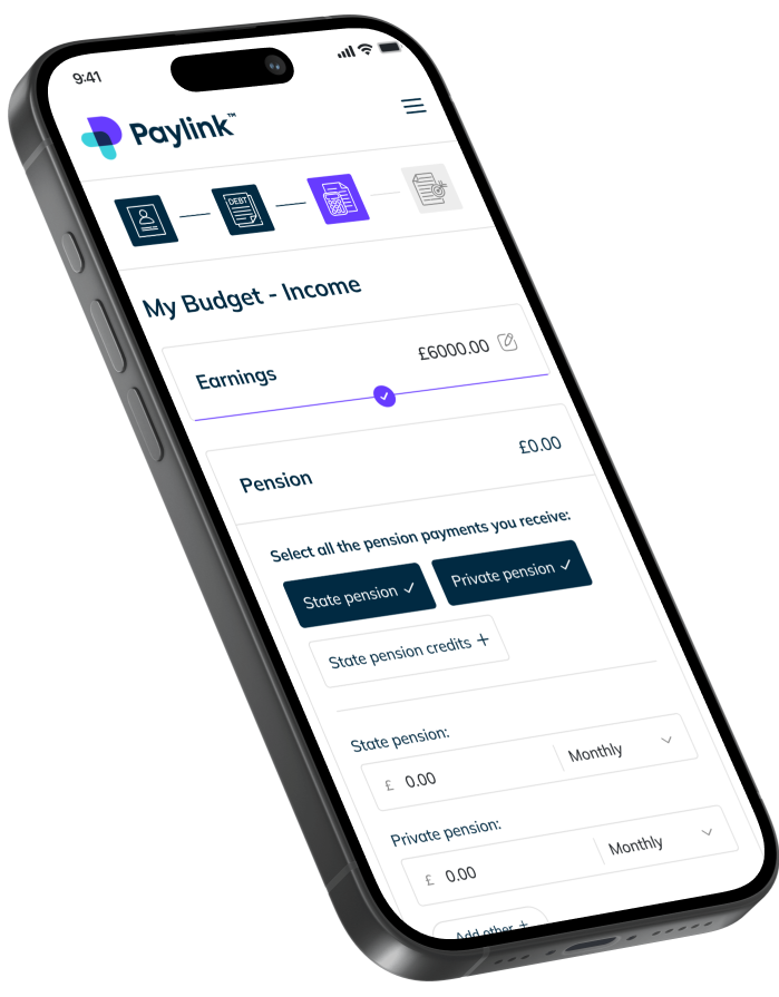
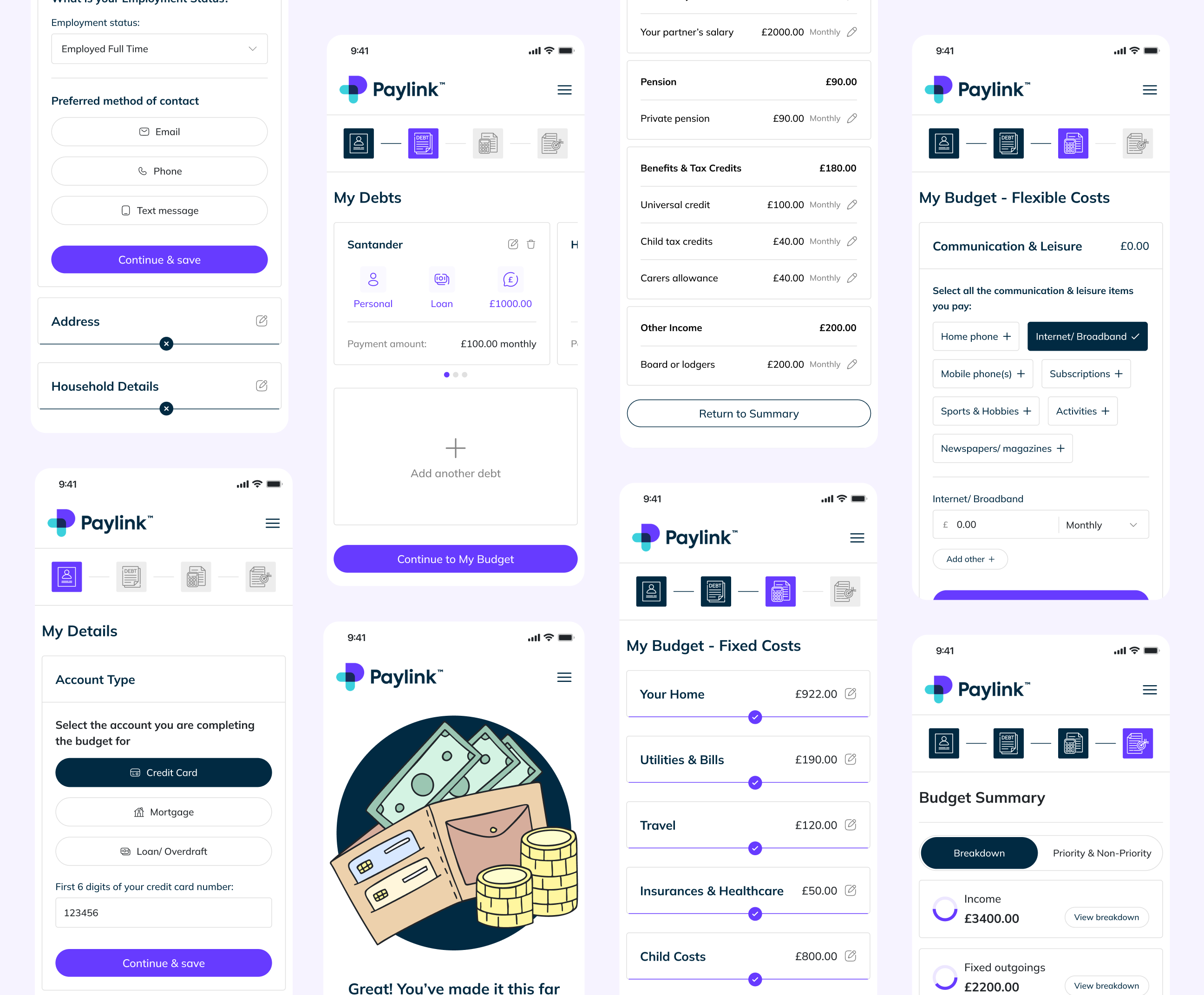
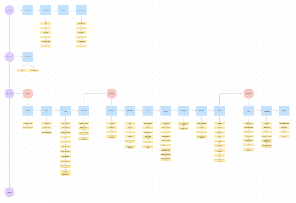
The main challenge for this project, was to create a strong design system that we could use on Mobile & Web apps. I used Atomic Design principles to create base components (text styles, color palette, buttons, icons, tags, inputs etc…). More complex components have been added to the design system all along the project, following the needs of the UI. Once finished, the design system had more than 400 components and was fully scalable.

CONSISTENCY IS KEY

When designing the screens, i tried to keep the same navigation & interaction patterns. The goal was to make sure that the users could use the product efficiently.

Final words

Overall, the project was a success, significantly impacting and receiving positive feedback from customers, clients, and employees. We saw an average monthly conversion increase of 11.2% and a reduction in completion time by 12 minutes. Analytics also showed fewer user “u-turns” and less user frustration. However, our work is not done. We are now focusing on optimizing the product through A/B testing to ensure continuous improvement and refinement of the user experience.

Prototype

View the responsive prototype to get the full look & feel of the web application!